‘Less is more.’ – Robert Browning.
Tone and Voice
Our campaign covers a sensitive subject which can be triggering towards many people. The aim is to create a comfortable and safe environment for those who are struggling and those who have come to do their research. Building that trust between us and the reader will encourage them to tell others to come and read our campaign and be more optimistic to trying our remedies we offer online, as well as listening to our advice and useful links we have provided in order to receive the help they needed if necessary.
We strive to engage with our demographic as much as possible, therefore using thermology that they understand, and simple but effective sentences in order to catch their eye. Our company aspires to come across as warming and welcoming as we can, we want to help, and we want to make a change.
Colour Choice
We as a campaign have opted for a basic colour range of Black, Grey and White. We are trying to display the message that you do not need to have flashy colours in order to be enough. We intend to carry a strong message and black and white writing ‘is clear and distinct. It will not be confused with anything else.’
The phrase ‘A picture is worth a thousand words’ comes into account here. We aim to use the images we have chosen in order to convey messages across, ‘One look is worth a thousand words – Frederick R. Barnard.’ Images allow the reader to interpret the way they feel, they can gather an understanding of what the campaign is about. The images also provide colour to the campaign thus allowing the individual to interpret this campaign is a positive site but just choosing to display it in a different unique way.
Logo Design
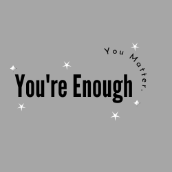
In the creation of the ‘You’re Enough’ logo we took into account our age demographic and the reasoning behind our campaign.
The decision on this campaign name was because we wanted to get the message across instantly that ‘You’re Enough.’ We wanted the logo to be simple and bold because instead of behind distracted by bright colours you see the message instantly that we care about what we are talking about. We decided to add a small subheading saying ‘You Matter.’ This is because we aim for the campaign to make those know that they’re cared for and we want to provide a sense of community.
Stars have been ‘symbolic of divine guidance and protection.’ We as a campaign decided to add stars in our logo because we want to provide guidance to those in need, stars also represent a sense of hope and a light at the end of the tunnel. Therefore, we believe seeing stars in the l0go will encourage people to view our campaign even more.
The You’re Enough campaign has used straightforward and transparent fonts, these fonts can be found on the website Canva where the logo was designed. Our decision to use simplistic fonts in our campaign throughout is to allow the readier to have an uncomplicated read, this allow us to make the impact we want to.
Use of Image
We as a campaign are relying dominantly on images to portray messages across to the viewer about what we are speaking about, which will be sourced from the royalty free website, Pexels. We aim to use these images on the website, video, and posts in order to catch the audience eye and make them want to read further on.
The primary logo will be included on the advertisement video as well as the Instagram and Tiktok Posts to create brand identity for the campaign. The creation of brand identity is important to make sure viewers and readers recognise your brand and make it recognisable for them.

